Every year we hear about multiple Colors of the Year being chosen for the upcoming change of the calendar, and perhaps no other year has put people in the mode for change quite like 2020. Will everything in our topsy turvy world go back to normal on January 1st, 2021? Unfortunately that is not the case, but there is definitely something magical about the change to a new year, with its promise of renewed hope and fresh opportunities. That’s why many people choose January as a time to rearrange and redesign their living spaces, and paint companies, interior design magazines and similar outlets are here to let us know what the hot colors will be in 2021.
We’ve put together a list of some of the colors we have heard about so far, chosen by design professionals and home decor enthusiasts. We are also offering a few suggestions as to how you can incorporate these colors into your 2021 design plans. Maybe you have multiple rooms that could use a refreshing change, or perhaps you can incorporate these colors through accents like pillows and throws. However you choose to welcome in the new year, we wish you a happy and colorful 2021!
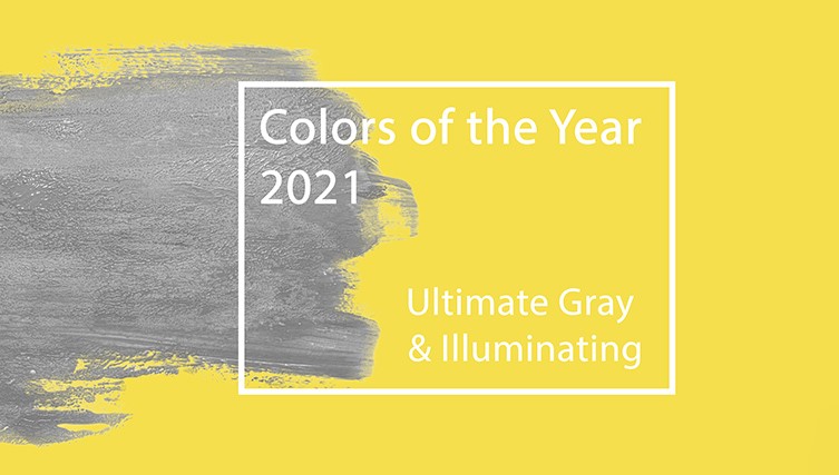
Ultimate Grey and Illuminating by Pantone
The color experts at Pantone have chosen two colors to represent 2021 – Ultimate Grey and Illuminating, which is a sunny yellow shade. These unique choices are contrasting colors, with one being a practical and neutral tone while the other is striking and bold. According to Leatrice Eiseman, executive director of the Pantone Color Institute, “The union of an enduring Ultimate Gray with the vibrant yellow Illuminating expresses a message of positivity supported by fortitude.” We could all use a bit of positivity and optimism after this past year, right?

Why was Ultimate Gray the specific neutral tone chosen? Gray itself has long been associated with resilience, strength and steadiness. It is almost impossible to discount the toll that the COVID-19 pandemic has had on all of us, and now we seek feelings of composure and calmness through the colors we surround ourselves with. Similar considerations came into play when Illuminating was selected. Yellow is a color of optimism and hope. Illuminating is bright and sunny and encourages us to think about the positive improvements to come in our lives.
So how should you incorporate these two colors into your own design? If you are in the mood to repaint a room, Ultimate Grey is a versatile neutral color that can be used in many types of rooms. It looks great in everything from farmhouse to industrial kitchens, can be a soothing bedroom color, and will even work in a living room or family room if paired with brighter and uplifting accent colors. So you know what that means! You can easily use both of Pantone’s picks together in a practical manner, by adding accents of Illuminating either as trim while painting, or in the form of pillows, vases, pillows and kitchen textiles.
Larger furniture pieces can also be a wonderful canvas for this color combination. Ultimate Gray is an ideal shade for a sofa or overstuffed chair, while cushions, pillows and blankets in Illuminating can provide just the right pop of color to balance out the neutral of the gray. Don’t be surprised if you see these two shades mixed in the form of chevron patterns on furniture upholstery this year as well.
Can you paint an entire room in Illuminating? You can, but this will only work in certain rooms and homes. Do you have a large living room with a lot of white woodwork such as a fireplace and built-in shelving? Illuminating will work well against these white accents, but be sure to keep your furniture and accents neutral. Black and white engravings and pillows will help tie the look together. If you are shying away from the idea of painting an entire room in Illuminating, you can use it on a single accent wall, or on interior or exterior doors.
Pantone’s selections for Colors of the Year are not meant for interior design alone. Look for the trend to spill over into several other arenas, such as beauty products and apparel. Picture the contrasting shades of Ultimate Gray and Illuminating in clothing items such as scarves, shawls and even footwear, along with accessories such as handbags and umbrellas. Nail polish is another place you can expect to see these colors, whether alone or in combination.
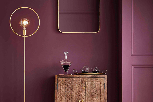
Urbane Bronze by Sherwin Williams
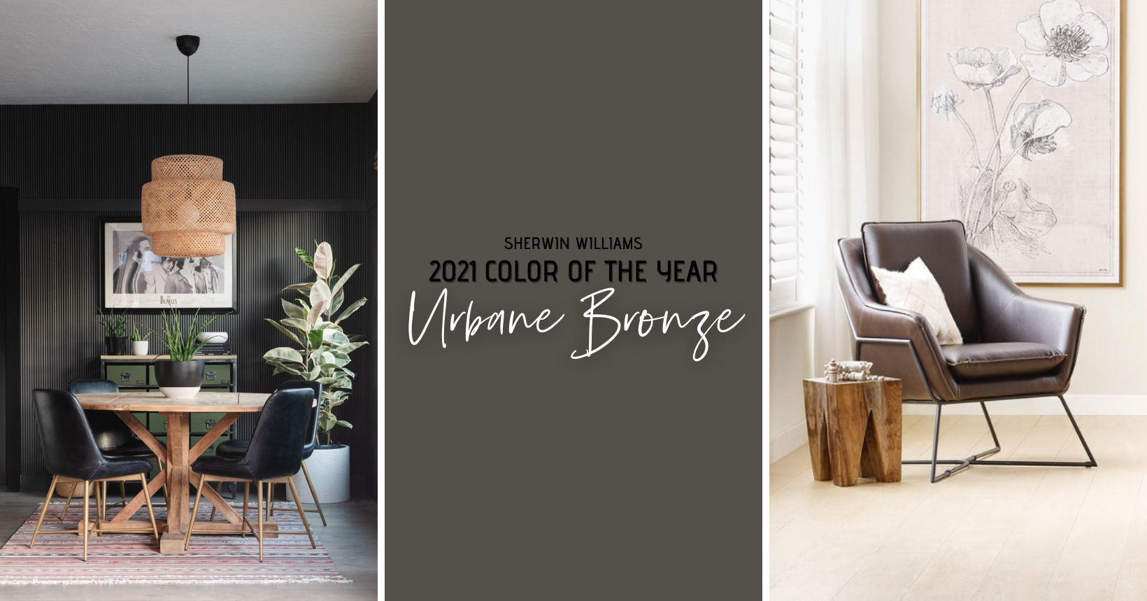
Urbane Bronze is a neutral, but it is such a bold and striking shade that it can be used in numerous ways. This shade that lies somewhere between gray and brown, evokes feelings of stability and serenity. It is versatile enough to use as the main color in a room, yet vivid enough to work as an accent alongside other shades. If you are planning to use it on all four walls in a room, Urbane Bronze will work wonderfully in a bedroom, as it is a soothing shade that will promote relaxation and inspire repose. You can also pair it with a warm white shade and use it either on an accent wall or on trim and cabinetry.
Because Urbane Bronze was inspired by the outside environment, natural materials complement the shade, such as woven textiles and stone accents. Living rooms, dens and dining rooms are all logical destinations for this shade, since it can be offset with vivid brights and neutral colors alike.
Aegean Teal by Benjamin Moore
We could all use a bit more tranquility in our surroundings, especially after a year like 2020. Benjamin Moore is here with a soothing blue green shade called Aegean Teal, a color that evokes memories of beach getaways and relaxing poolside at a Caribbean resort. Could all of those cancelled vacations and missed time by the sea be responsible for this choice by Benjamin Moore? We can’t be sure, but in a year when so many of us didn’t receive the amount of “Vitamin Sea” we would prefer, Aegean Teal is a soothing substitute.
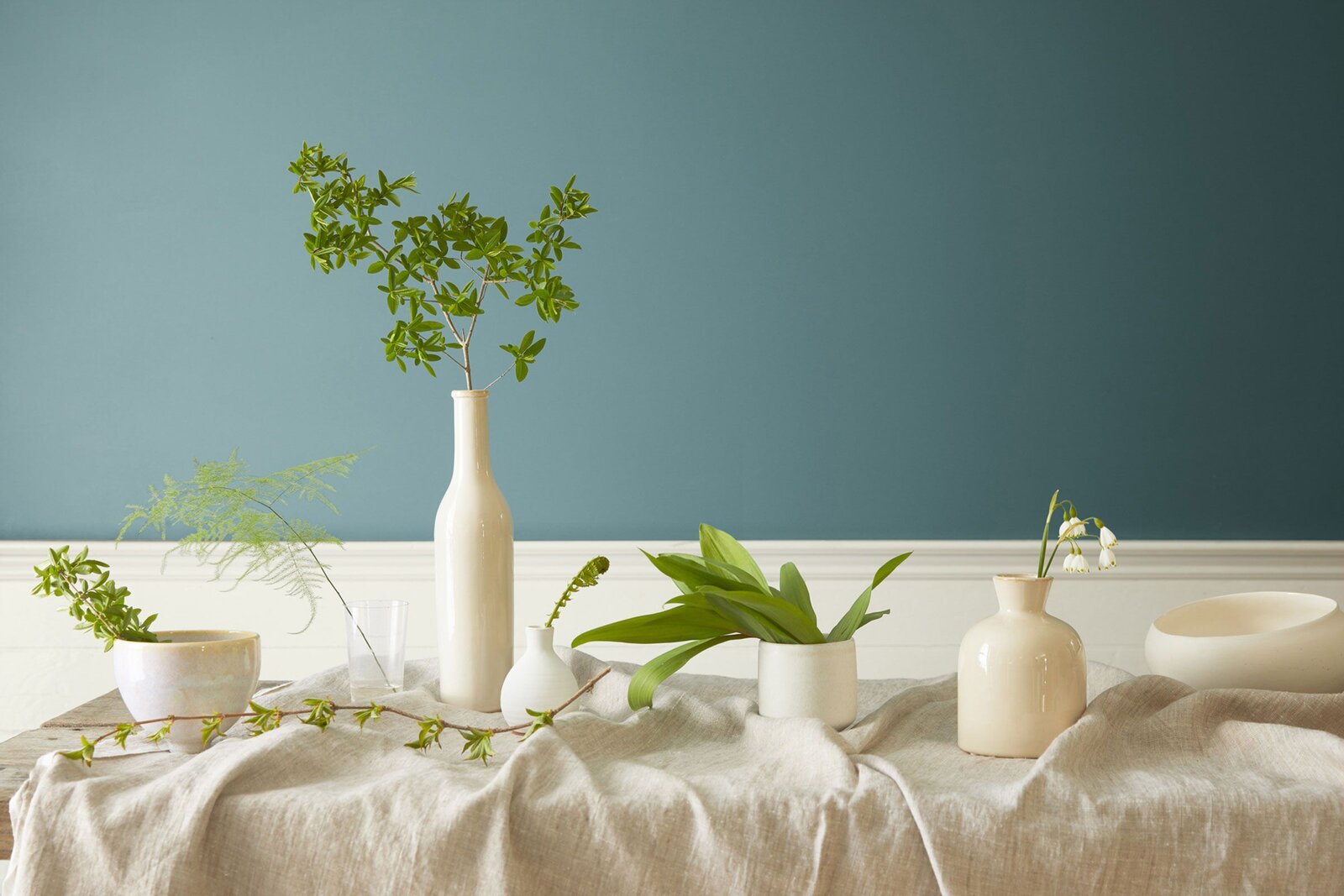
Blue has a calming effect while green is associated with wellness and inner peace. Aegean Teal combines the benefits of both colors, making it ideal for bedrooms and home offices, along with bathrooms and solariums. As an accent color, Aegean Teal looks great on kitchen and bathroom cabinetry and on built-in shelving, and is also a wonderful choice for walls that incorporate brick and stone accents. Match this color with a smooth deep yellow or an off-white for depth.
Orchid Flower by Coloro
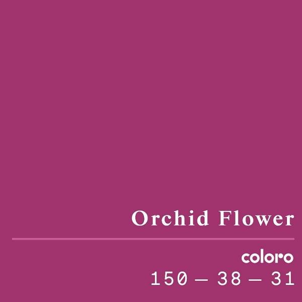
You might not have heard of Coloro, the London based European equivalent of Pantone, but their color selections are just as authoritative. Their choice for 2021 is Orchid Flower, an intense and energizing shade meant to stand out in both real-life and digital settings. In these challenging times, Orchid Flower’s bright magenta tone helps to create a sense of positivity and escapism.
How should you incorporate such a bold color as this? You can use Orchid Flower in your home on accent walls in bedrooms and living areas. Against a more neutral background, this bright and happy hue will give an otherwise natural toned space just the right amount of pop to create interest. Pillows and throw blankets, kitchen linens and even wallpaper in this shade are perfect ways to bring Orchid Flower into your home.
Brave Ground by Dulux
The UK based paint company Dulux has assembled a team of international designers and global color experts to decide on a color for 2021. After much discussion Dulux has introduced Brave Ground as their color of the year. This versatile shade is a warm and neutral brown that adds balance to any room. It can be paired with other similar neutrals for a warm and unifying look, or it can be used to complement bright reds for a bolder color combination.
Epoch by Graham & Brown
Another UK firm with a Color of the Year pick is Graham & Brown, which is primarily known as a wallpaper manufacturer. Their choice for 2021 is Epoch, a bold and regal purple hue that can be used in various ways throughout your home. This is a striking color, so depending on how dramatic you want to be, you can use this on an accent wall or on cabinetry and trim. Pair Epoch with a soft lavender or teal and use near gold and bronze accents for a rich and sophisticated flair of drama. Or you can mix this bright color with more neutral peach and pink tones to tone down the drama just a bit.
Aqua Fiesta by Glidden
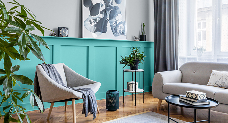
Rather than choosing an all-purpose color of the year, Glidden has instead offered an accent color of the year. Aqua Fiesta is a bright aquamarine shade that is both energizing and tranquil all at once. This is an accent color, and is best used on one accent wall combined with a neutral color on the adjacent walls or on woodwork and trim. Glidden suggests mixing Aqua Fiesta with a cool gray to lend a spa-like quality to any room, so we suggest this for a bedroom or master bath. You can also use it in living areas, especially in rooms with a lot of white or cream fabrics.
Satin Paprika by Rust-Oleum
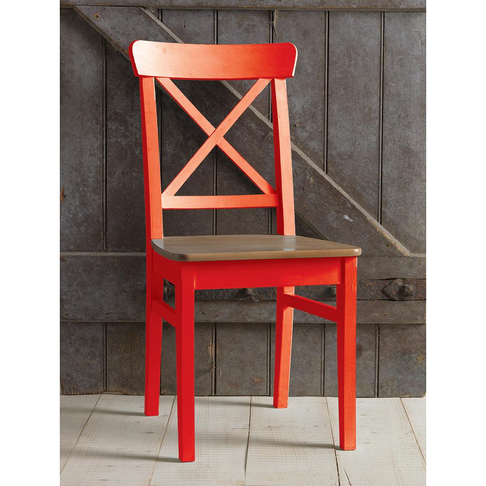
With the DIY craze having taken off even more during the past year of quarantine, it’s no surprise that the popular spray paint brand Rust-Oleum has also gotten in on the color of the year selection. Satin Paprika is their choice, and this warm and earthy red is a perfect indoor and outdoor shade. If you are a DIY fan yourself, you can use Satin Paprika in many projects, such as while refinishing small tables, chairs and accent furniture, and it can also be used for items such as lamps, vases and frames. Satin Paprika mixes well with other earthy tones, and also looks great with brass and matte black finishes.